
Harmonic
Alignment
Collaborative
A heart-centered entrepreneur looking to cultivate harmony through music and healing.
Branding Level 1: Simply Aligned
Harmonic Alignment’s mission is to help women come back into alignment with their soul’s purpose using sound and frequency to elevate their consciousness and heal their body, mind and soul. Through sacred pilgrimages, healing devices and coaching, Priscilla hopes to make a real impact on as many people as possible.
Step One: Naming
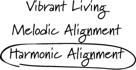
Inzpire worked with the client to come up with a unique name that married Priscilla’s love for music and singing with her passion for helping others. Researching words and phrases that bridged the gap and felt in alignment with her services ultimately lead to a name that was both unique and representative of her.
Step Two: Logo Design
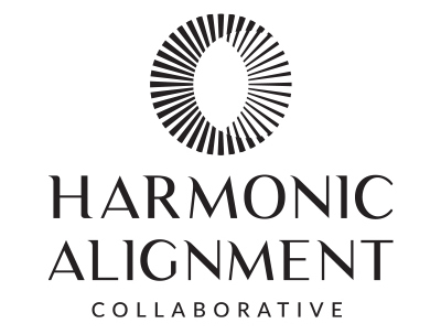
Next, the design team was tasked with creating three distinct marks that were representative of sound and multiple objects merging together in “harmony”. We always provide round 1 logos in black and white to help solidify a concept and then later add color as an enhancement.
Step Three: Revisions
After reviewing with the client and receiving feedback, we moved further into exploring mark 3.
The client responded positively to the typography used in mark 3 but wanted to further explore a more high-contrast and impactful circular icon. The circular mark has multiple meanings one of which ties back to the original intent of multiple objects coming into alignment or “harmony”. The centered layout of the logo helped to further represent the balance that Priscilla’s work helps her clients to achieve.
Step Four: Color Study
Harmonic Alignment is based on the merging of sacred practices with modern devices and healing modalities. Knowing that, as a design team, our goal was to create a palette that best portrayed both old and new in a array of colors that feel traditional yet contemporary.
Step Five: Brand Guide
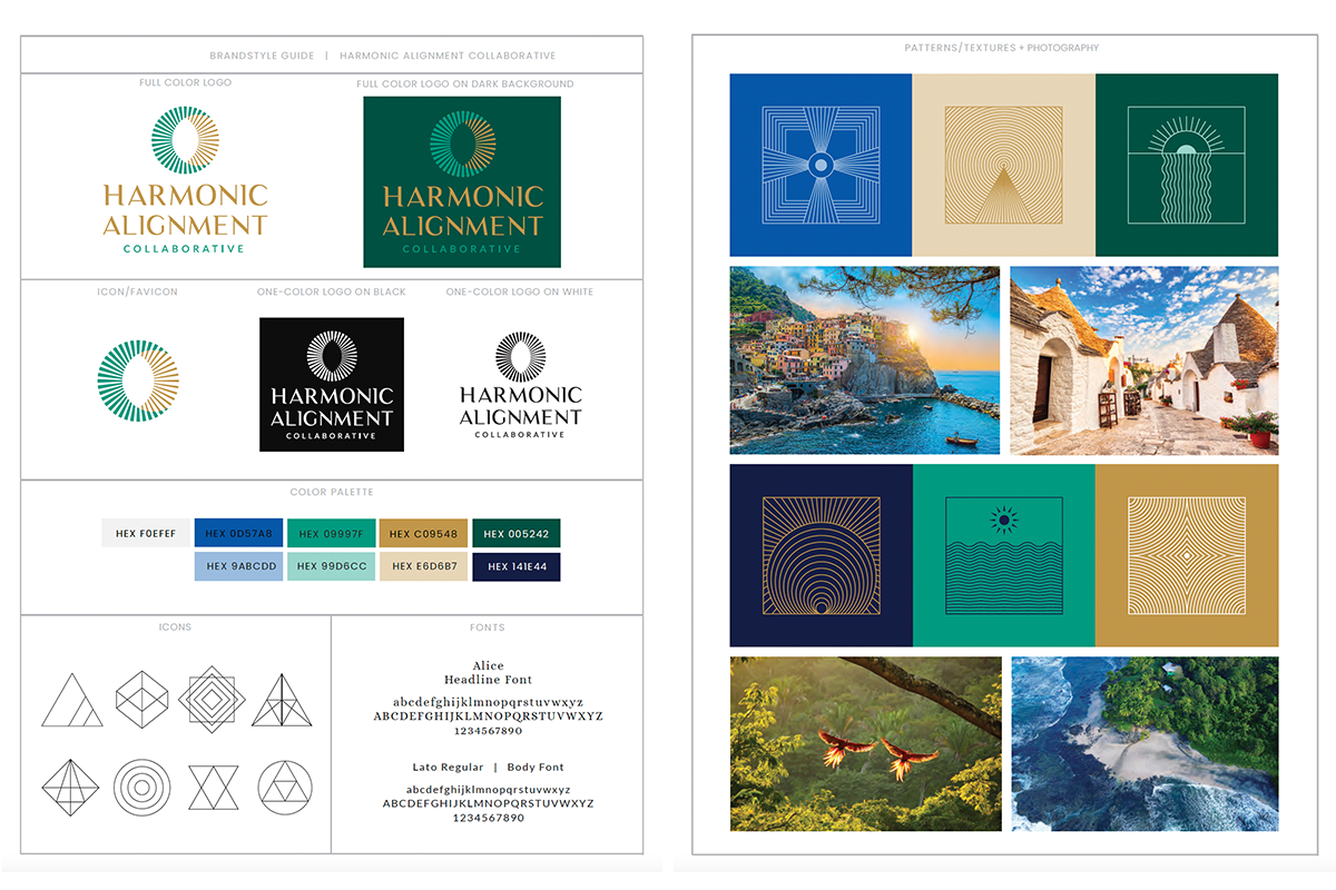
After we finalized the logo and color palette, our last step involves creating what we call a brand guide. A brand guide provides a comprehensive kit that includes additional design elements such as complementary fonts, an expanded color palette, iconography, patterns/textures, and a photography style. This piece is key in elevating our client’s project from just a logo mark into a full brand. The client is then able to walk away with a complete system to inform the look and feel of their website or any other marketing materials they’ll need in the future.
Are you ready to build your own brand?
Fill out the form below to schedule a discovery call.

© Copyright 2022 Inzpire LLC